Categories
- Genres
- Content
- Audiences
- Sectors
- Functions
- Format
Editorial and Publishing
General Magazine Categories
- Fashion
- Music
- Lifestyle
- Health and beauty
- Current affairs
- Photography
- Technology
- The arts
- Hobbyest
- Food and cooking
- The home
Publishing
- Fiction
- Non fiction
- Travel
- Biographies
- Manuals
- Children's books
- Education
- Training
- Reference
- Languages
General Publication
- Annual reports
- Catalogues (commercial)
- Self publication (event)
- Creative press
- Brochures
- Instructional
- Public sector
- Fanzines
Retail and Promotion
- Tags
- Bags
- Signage
- Environment
- Logo
Product and Packaging
- Calendars
- Stationary
- T-shirts
- Gift wrap
- Displays
Design Practises
- Information and way-finding
- Publishing and editorial design
- Branding and identity
- Product and packaging
- Retail and promotion
Task
- 5 examples of websites/blogs. that will help you to define information & way-finding design.
- 5 examples of websites/blogs. that will help you to define product & packaging design.
- 5 examples of websites/blogs. that will help you to define branding & identity design.
- 5 examples of websites/blogs. that will help you to define editorial and publishing design.
- 5 examples of websites/blogs. that will help you to define retail and & promotion.
Information & way-finding design
Information and way-finding is about getting from one place to another as efficiently as possible. This can be achieved from systems of visual, audible, and tactile cues. All of these elements effect both the experience of choosing a path, and the set of design components that aid in the decision.
Information and way-finding is about getting from one place to another as efficiently as possible. This can be achieved from systems of visual, audible, and tactile cues. All of these elements effect both the experience of choosing a path, and the set of design components that aid in the decision.
- http://www.wolfstrome.com
- http://applied-espi.com
- http://www.ininfo.co.uk/index.html
- http://www.rivermeade.com
- http://www.holmes-wood.com/#/index.php
1.


The examples above are for Europa Studios in north-west London. It is an art deco building and has been designed for 'creative' businesses.
This style of design is successful in targeting 'creative' minds through the exaggerated, playful elements, such as, the enlarged male/female symbols that would feature in the general public domain in a generic format.
2.

The image above has been designed for Virgin Atlantic for all customer facing.
They have created a system that is distinctive and clearly recognisable to the general public, communicating a universal language through signs and symbols.
3.


The images above were designed for the Tate Modern.
They have created a solution that is elegant, minimal, and durable. This style of design works well in the context, not distracting the public from the main focus, the artwork.
4.


The placement of the graphics works together with the use of bright, eye catching colours that draw you in when walking past. The amount of circles used looks cluttered and busy. However this works to project the information in the text.
5.

The image above was designed for the Leeds Art Gallery.
The entrance to the gallery is on a busy pedestrian street. The 'zigzag' design on the exterior works well to provide multiple surfaces to communicate information that can be viewed from both directions.
6.


The images above were designed for Accenture’s 375,000-square-foot London HQ at Plantation Place in Fenchurch Street.
Each section has been colour coded, breaking it up into manageable chunks, which people can easily get to grips with. It has been applied in such a way to create distinctive, instantly recognisable spaces giving people context and orientation.
7.


The images above were created for Chevron house's new premises in Hill of Rubislaw, Aberdeen.
A series of bright canvasses have been strategically positioned throughout the building to achieve a strong, identifiable presence on each floor.
8.


9.


The images above were created for The Centre for Health Science in Inverness.
The signage system has been designed to enable staff, visitors and patients to easily find their way through the building. All the information is dual-language and can be easily updated if needed. It has a strong brand identity which features on all the signage throughout the building.
10.


The images above were part of a city-wide installation, Brighton. 41 Places was an artwork of 41 true stories, installed in the places where they happened.
This great experiment questions the idea of changing the context of where you read something, can dramatically affect how you read it. It also encourages people to go off route and explore the city, creating a memorable experience that could make you want to return.
Product & packaging design
Product and packaging design is meant to attract the customer. It does this by provoking emotions, through the use of colour, creative layouts, and a general attractive aesthetic. It has to inform the customer with the information displayed and target the right audience.


 Created by design firm Fresh chicken.
This packaging plays off the brand name 'Honey Hunters', creating a dark, edgy theme through the use of simple illustration to create a fresh branding that goes against the norm.
- http://www.smashingmagazine.com/2008/06/02/beautiful-and-expressive-packaging-design/
- http://www.webdesignerdepot.com/2009/05/50-beautiful-and-effective-package-designs/
- http://www.thedieline.com
- http://www.topdesignmag.com/70-unique-product-packaging-design/
- http://lovelypackage.com
1.


The images above were designed for Tokyo’s 100% Chocolate Cafe.
With over 56 different types of chocolates the packaging is successful in communicating each flavour through the use of bright colours;which acts as an identification system, and simple design that has a modernist feel to it.
2.


The images above were designed for Eroski Snacks.
Each packaging is easily identified by the colours used and the animal displayed on the front. This makes it possible to recognise the product easily and quickly, whilst communicating a fun, refreshing image for the brand.
3.


The images above were created by a Russian design firm 'Fresh Chicken' for the brand 'Bolshaya pol'za.
The package design uses info graphics to inform the customer on different ways the product can be used. For example, on the front side is a list of flour recipes with a measuring rule on the side. The simple colours make it easy to distinguish specific types on store shelves.
4.


Created by Embrace Brands for Tea India.
The design communicates the essence of India. The henna inspired illustration combined with the colours convey energy and vibrancy to communicate the flavours of the teas.
5.


The images above were created by Taxi Studio for drinks supplier Carlsberg UK.
The design centres around an ambiguous apple identity that playfully reinforces the message of purity and flavour.
6.


This packaging plays off the brand name 'Honey Hunters', creating a dark, edgy theme through the use of simple illustration to create a fresh branding that goes against the norm.
7.

 Packaging redesign of DeCecco by Kate Yip.
The clear window on the front allows the customers to view the product and entice them into buying it. The information is clearly displayed on the back and sides in a simple column format to create a modern, sophisticated design.
8.

 Designed by Chris Trivizas for the winery Markogianni.
The corresponding symbols on the labels creates a strong, common visual identity that can be easily recognised by the customer.


Designed by DentsuBos for the electronics store KébecSon.
This packaging utilises the design elements in a creative way to successfully communicate a love for sound and technology.
10.


 Designed by Curious Design for Open1.
The product is a alcohol-free tonic that is suppose to lift your mood in a healthy way. The design communicates this by clever use of interlocking circles encasing a 'positive' central icon. It has a scientific feel which reflects the carefully selected amino acids and natural plant extracts. Overall, a successful, refreshing design.
Branding & identity design
Branding can be described as all the elements that form the foundations of an organisation. For example, a service, or a product with a 'personality' that is conceived by the perceptions of the audience.


The clear window on the front allows the customers to view the product and entice them into buying it. The information is clearly displayed on the back and sides in a simple column format to create a modern, sophisticated design.
8.


The corresponding symbols on the labels creates a strong, common visual identity that can be easily recognised by the customer.
9.


This packaging utilises the design elements in a creative way to successfully communicate a love for sound and technology.
10.


The product is a alcohol-free tonic that is suppose to lift your mood in a healthy way. The design communicates this by clever use of interlocking circles encasing a 'positive' central icon. It has a scientific feel which reflects the carefully selected amino acids and natural plant extracts. Overall, a successful, refreshing design.
Branding & identity design
Branding can be described as all the elements that form the foundations of an organisation. For example, a service, or a product with a 'personality' that is conceived by the perceptions of the audience.
Identity design is based around the visual devices used within a company. There is usually a set of guidelines that make up the identity, and conducts how its applied across a variety of mediums. This ensures the identity is kept coherent, and recognisable.
1.
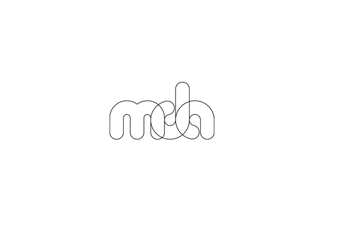

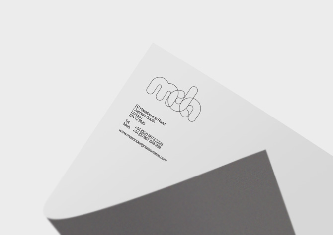
Mason Design Associates- Brand identity and business card design
This brand identity is for an architect company. The minimal approach, clinical colours and a simple, recognisable logotype with interacting letter forms, successfully communicates a professional and contemporary approach.
2.


The elegant and sophisticated design, offset by indulging colours, reflects the specialisation of the company, use of exquisite materials and attention to detail.
3.


GNNSJ- Brand identity and stationary design
GNNSJ is a Sikh organisation with strict cultural and historical boundaries. With this in mind, the strong palette works to clearly define the group, making them instantly recognisable, communicating their heritage in a striking fashion.
4.

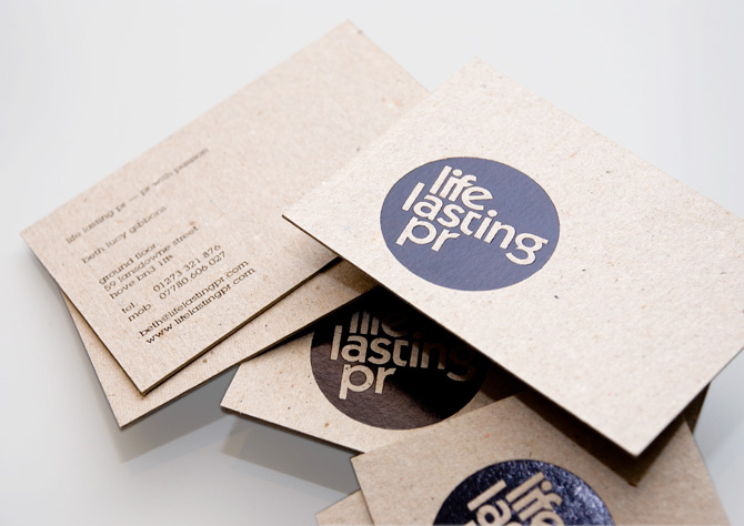
Life Lasting PR- Brand identity and business card design
Life Lasting PR is a fashion agency. The 'stamp' style logotype works well with the raw grey stock to communicate a boutique, retro style that portrays a genuine, down to earth identity.


Enville Capital UK- Brand identity and brochure design
With a target audience of extreme wealth, the luxurious, rich mix of gold metallic on a chocolate brown, along with a contrasting mix of matt and gloss varnishes, gold foil and blind embossing, successfully communicates an ora of wealth and power. It works well in projecting confidence through design.
6.
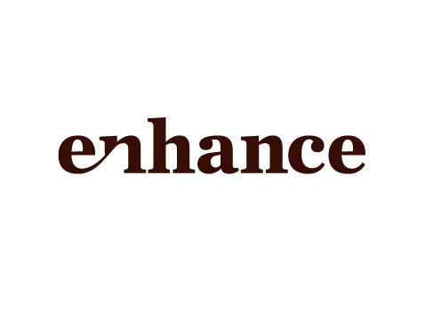


Enhance are a interior furnishing company. The fashion inspired patterns, elegant typography and warm comforting colours, successfully reflect the high end products.
7.


Indian Cowboy Snacks- Brand identity and packaging design
The product needed to target bars, gastropubs and supermarkets in the UK. It sucessfully does this through the tone of voice and playful personality which creates appetite appeal. The bold slab serif typography, over the silhouette illustration, provides great shelf presence.
8.


First Capital Connect- Branding Thameslink Programe design
The challenge was to brand and inform the customers with bad news. I think they have successfully achieved this by communicating in a clear, impactful way. The colourful graphics grab the attention, followed by a simple messaging strategy for maximum impact, yet minimum hassle to compensate for the short term inconvenience.
9.


Ginger Goose- Branding identity
Ginger Goose are an established video production company. The branding essence embodies vibrancy, stimulation and impact. The distinctive visual style successfully illustrates and reinforces the individuality and energy of the company ethos.
10.


Eureka- East coast mainline brand identity
The branding's aim was to inform customers of the improved services. It needs to target customers that are in a rush and surrounded by advertising. It successfully does this with distinctive simple graphics combined with punchy copy headlines for maximum readability.
Editorial and publishing design
Editorial and publishing design is an understanding of structure and layout to develop a functional, exciting publication. This may include magazines, newspapers, books, journals etc. The main components consist of pictures and text, so an understanding of typography, layouts, grids and composition is required. All editorial and publishing work is created to be printed.
- http://www.designcouncil.org.uk/about-design/types-of-design/graphic-design/editorial-design/
- http://www.behance.net/search?field=32
- http://abduzeedo.com/taste-editorial-design-inspiration
- http://creattica.com/editorial/latest
- http://www.tumblr.com/tagged/editorial-design
1.


Kasper-Florio- Heimspiel
This editorial design acts as a visual identity for an art exhibition. The minimal aesthetic and perspectively opening doors offers a chance for the viewer to experience the creativity of the exhibition.
2.

Caixa BI Annual Report
This example of editorial design successfully communicates data in a clear and precise way. The soothing colour scheme combined with a logical layout makes it easy to digest.
3.
 Kiwi - ARIDI


Next level Magazine
Next level magazine is an internation art publication that showcases photographic art, creativity and culture. The design successfully communicates this by drawing the main focus to the photography. The elements of text are clearly separated in compact segments of different stock.
7.

This catalogue design displays a range of furniture for singular offices. With the focus being on the product, the layout utilises the space to allow maximum space for the photographic elements.
4.


Oxo : On Editorial catalogue
Catalogue for office and middle management furniture ranges. It uses a simple grid system to display the information clearly and efficently. The fold out pages help the reader to understand the products versatility.
5.


Mediclinics- Catalogue redesign
This design uses a intuitive system of symbols to highlight the different products and their features. Each section is coloured coded for easy navigation followed by a balanced composition.
6.


Next level Magazine
Next level magazine is an internation art publication that showcases photographic art, creativity and culture. The design successfully communicates this by drawing the main focus to the photography. The elements of text are clearly separated in compact segments of different stock.
7.


The Outpost magazine
The Outpost identifies, understands and analyses the changing Middle East. The wide range of material informs, inspires and entertains with the help of a beautiful layout, strong logical use of grids, enticing typography and a charming colour scheme.
8.


Volta Magazine
Volta magazine is about alternative energy sources in historical perspective. The design is seperated into sections to represent the historical evolution. The parts about the past have a yellowish background and use black and white images, drop caps and a rigid grid. The parts about the present, have a white background, and mostly use photos with little infographics with a more complex grid. The parts about the future have no fixed background colour and are completely based on infographics.
9.


Information Newspaper
The information newspaper is a contemporary take on the traditional established newspapers. It uses clean sans-serif fonts on the front page for the headlines accompanied by a bright eye catching image to target a young modern audience.
10.


Murakami book covers
These book covers for the Murakami collection utilise negative space to create multiply meanings within the illustrations. This also works as a tool to get the imagination working before the consumer has even started reading the story.
Retail and promotions are designed to promote the services and goods offered in the business district to generate sales. Achieved with graphics, retail and promotional material has to be attention grabbing, attractive and cost effective.
- http://www.haringwoods.com/#/retail-promotion/4560178805
- http://www.kokoon.co.uk/printing-services/retail-graphics/
- http://www.rgla.com/index.html
- http://www.superchrome.co.uk/retail_graphics.htm
- http://www.oasisgraphic.co.uk/retail-and-promotional.html
1.

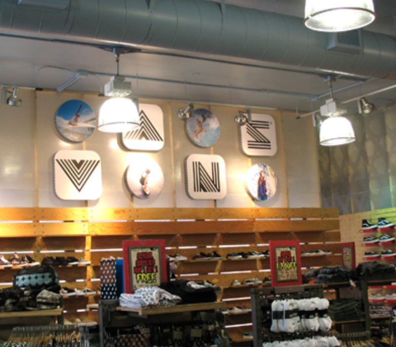


Vans Heritage
The Vans Heritage store design authentically references graffiti and the street, which skateboarding is normal associated with. The use of retro props and vintage furniture creates a relaxed environment.
2.


Pez visitor centre
The Pez visitor centre has been designed to enhance Pez brand awareness. The over the top, playfulness of the features works to sucessfully entertain and inform the visitor.
3.

Kings Walk- Shopping mall graphics
The warm bright colour generated from the lights looks inviting to the public walking past, encouraging them to come into the store. The subtle, serif font creates a friendly tone of voice further enticing the customer.
4.


Au Natural
The pastel colours and geometric forms have influences of modernism to create a minimal, clean aesthetic, portraying a fresh modern company.
5.

6.

This Apple Ipod promotion successfully demands the viewers attention due to its large scale and contrasting colours, offset by negative space that makes it instantly recognisable from a distance.
7.

These Olympic banners work well as a set to portray movement and energy, the contrasting, yet complimentary colours create vibrance and excitement surrounding the event.
8.


The over the top use of typography in the windows, offset on the green background demands attention. The illustration of the eye is nicely framed within the arch of the architecture to draw focus to the name of the building.
9.

The Swarovski logo is centred above the entrance of the shop, accompanied by the metal, sculpture like banner to portray elegance and worth, associated with the products. This is reinforced by the image in the window that creates an ora of mysticism.
10.

The vivid red platforms in front of the black and white imagery successfully displays the products, making them stand out. The city themed photography conveys a modern, busy independent lifestyle to attract a particular target audience.
No comments:
Post a Comment