Friday 26 October 2012

OUGD403 Message and Delivery: Research

Message and DeliveryResearch Crit


Todays crit was the most enjoyable so far for me. The people in my group had some really interesting articles that I didn't know much about. However I enjoyed listening and discussing information everyone contributed .

The feedback I received was positive and helped me confirm that the route I want to take my research in, is a good direction.

I have decided to investigate the increase of endangered species and wildlife, in and around the exclusion zone of the Chernobyl power station.


Message and DeliveryResearch 2 crit

For this crit we were split into two groups and asked to evaluate the other groups posters individually. 
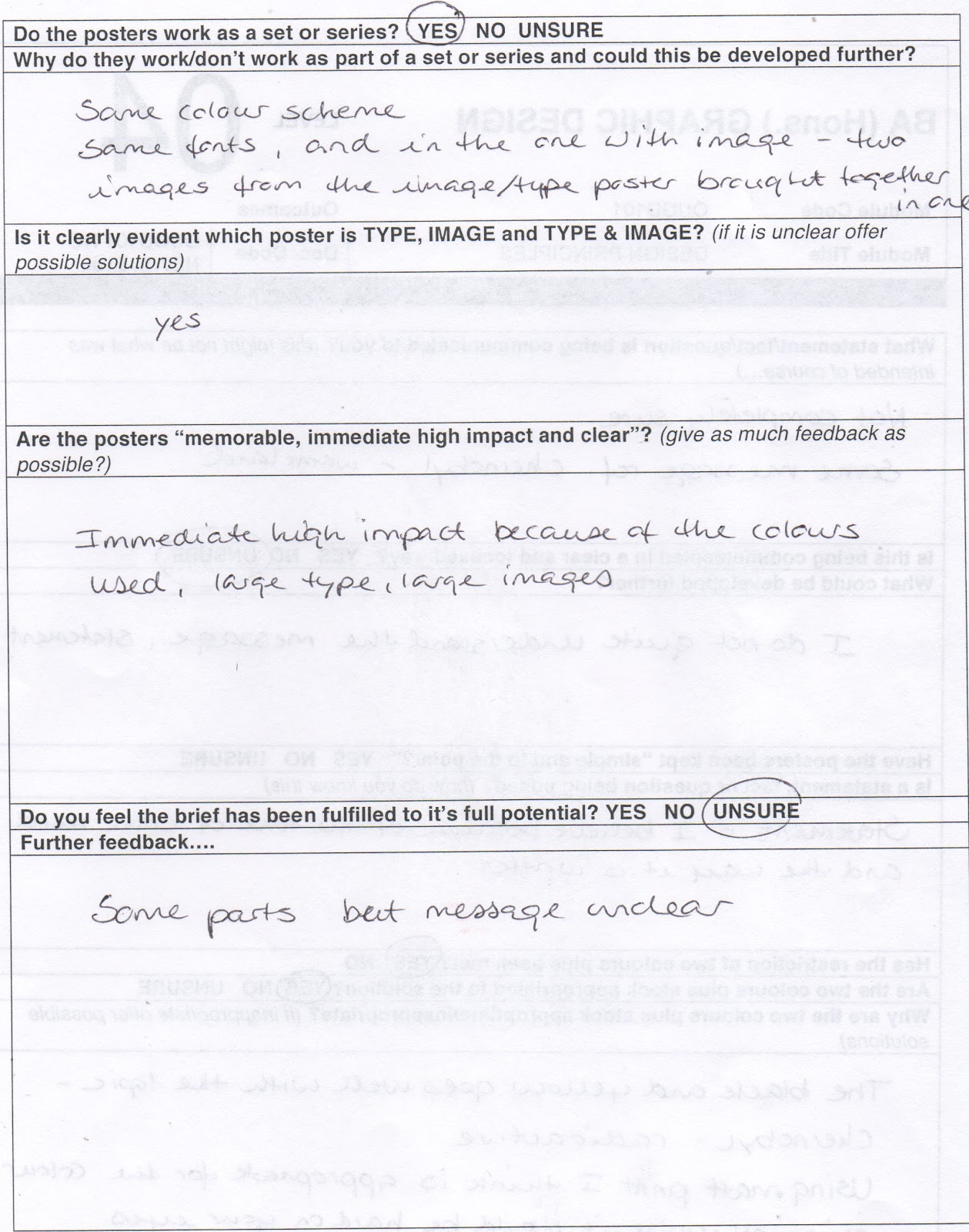

Feedback from peers


Final Designs


The feedback I received was really constructive and helpful. Overall it was positive, however the majority of people said that the message could do with being a little clearer and maybe more literal. I think this a fair point but I'm not sure how to resolve the issue without losing the immediate impact. I could possibly make it more obvious on the type poster by rewriting the statement, clearly stating the reference to the thriving biodiversity.
 The positives were that they thought the colour scheme was successful in communicating the nuclear aspects, combined with the simplicity of  the overall aesthetic for maximum high impact.

I really enjoyed this brief but found it a challenge to communicate the concept without over complicating. 


Thursday 18 October 2012

Question5. Is the writing style academic or informal?

Question4. Are design decisions thorough and evidenced?

Question3. Has all work been blogged?

Question2. Is there annotation on each post or is it just simply images?

Question1. Is the content of each post clearly identifiable in each title?

OUGD402- PPP 1 Feedback Exercise

After a presentation about higher education we were asked individually compile a list of things we would like feedback on. My list as follows:

  • Blog
  • Written work
  • Design work
  • Presenting work
  • Work flow
  • Ideas, concepts 
  • Colour schemes 
  • Use of materials/ Media
  • Research 
We then compiled a group list of the most relevant to the course and the work we have done so far.

  1. Use of blog- Content, Tagging, Organisation, Quantity, Quality 
  2. Assessment criteria 
  3. Project time management 
  4. Academic writing skills 
  5. Critical evaluation 
  6. Quality of work 
  7. Design decisions
  8. Understanding design principles 
  9. Individual progress 
  10. Appropriate responses 
We then had to agree on ten questions in our blog groups that we would like feedback on.


1. Is there evidence of successful time management?
Time and date of post in relation to when set

2. Is the content of each post clearly identifiable in each title?
Check PPP, design context, design practice

3. Is there annotation on each post or is it just simply images?
Check PPP, design context, design practice

4. Are posts in the correct place?
Check all posts

5. Has all work been blogged?
Check briefs

6. Are design decisions thorough and evidenced?
Read through

7. Is the writing style academic or informal?
Use of vocabulary

8. Are all images linked?
Check images

9. Are all posts labelled/tagged? (orange link)
Check all posts

10. Are all blogs linked to the homepage?
Check homepage

The questions I am going to ask for feedback on are:

2.
3.
5.
6.
7.


Friday 12 October 2012

OUGD403 Visual Thinking- Alphabet Soup: Typeface

Power Crit

In todays crit we were in groups of six, plus two tutors. We each had four minuets to explain what we had been up to followed by any questions and feedback we wanted to know.

The feedback I received was really useful and gave me a better understanding of what I need to do next. Feedback as follows:

  • Work as a sequence 
I asked the group if they thought I should chose one of my letterforms and develop the rest in the same style. I have three designs of each letterform so I was advised to pick the strongest of each one. I agree with this because I think it will make my alphabet more varied, better representing Danielle's personality.

  • Scale
It was suggested to me to think about the scale of my letterforms. They consist of a lot of detail which could cause a problem when scaled down. To resolve this, once I have finished my experiments, I am going to test them digitally to check the legibility.

  • Silhouette  
My experiments are line drawings so It was suggested to fill in areas with black. I completely agree with this as I think it will bring them to life. I am going to do this digitally to save time.


Self Evaluation


The feedback I  received from the group crit was really positive. My partner said she felt I had communicated her personality effectively. I found it interesting how different our alphabets were even though we had the same brief. 


I set out to design an alphabet that visually communicated my partners personality and character. 

I decided to solve this problem by focusing on the things that stood out to me when we had our first discussion about our interests. Her heritage is Spanish, Italian, Ukrainian and Hungarian. I found this interesting and a good starting point, so when she told me she was interested in pattern design and fashion, I decided to look at textiles and pattern designs from the countries of her heritage.

The font I chose to manipulate was nouvelle vague. I chose this font because I was interested in the contrast between the thick and thins of the letterforms. I felt this best fitted Danielle's personality as she's a small person with a large personality.

Overall I am pleased with the out come of my final design. It was a tedious job drawing but I enjoyed the whole process because I wouldn't usually design something in this style, so it was nice to be put out of my comfort zone. If I was to do it again I would consider the scale more because it looks good at a large scale but once descaled the detail gets a little lost. Finally, I would experiment with different techniques and media. I spent too much time tracing and possibly could of enhanced my work by being more experimental.


Saturday 6 October 2012

OUGD403 Visual Thinking- Part1 Alphabet Soup

Group Crit

For the crit we were put into random groups where each person gave a short description about their letterforms. The group was asked to chose the strongest five from each person. The image below is each persons strongest five letterforms.


It was interesting seeing everyones work and seeing how differently they interpreted their chosen words. I enjoyed getting to critique their work as well, it was nice to be able to offer my opinions and thoughts.  

The five letters that the group felt were my strongest are

  • E
  • A
  • K
  • G
  • N
I feel the strongest are W, B, E, R and H so it was interesting to see that we agreed on one out five.

Self Evaluation


 I set out to design ten letterforms that visually communicated the word 'Layer'.

I decided to solve this problem by combining visual aspects with concept. The font I chose to manipulate was Helvetica Neue and I chose this font because it consists of seven weight sizes within the set.  I wanted to combine elements from each weight to construct my letterforms. The idea was to create depth and the illusion of layers on a 2D platform.

I created them by firstly, tracing the thinest letter weight, which is the base for each letterform and then tracing different elements of the letter weights positioned off centred, either to the left or right. To finish them off I connected the corners to achieve the perspective.

By connecting the corners it has created a disjointed, warped perspective which is what I set out to achieve. I thought about adding colour and textures but decided against it because I think the negative space adds to the illusion. The space tricks the eye and makes my mind adjust to try and work out the layers.

I am please with the out come in general but I found the letters with curved lines a real challenge to draw. I found it difficult to keep my hand steady to achieve the clinical finish I was looking for. This is something I would like to improve on in the future.