Sunday, 24 March 2013

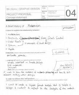
OUGD401- Context of Practice1- A Brief History of....

Progress crit

We had to present our proposal to the group and write down feedback that we received. The feedback I received was a bit vague however, some good suggestions were made to help me move forward. My research was focused on the content so it was suggested that I explore the practical side more before I start to make some design decisions. I agree with this as it was the next stage I was intending to research. 

Friday, 22 March 2013

OUGD406- Speaking From Experience

Crit 1


Concept, Method of Delivery, Method of Production Boards

I had to present my design boards to the group. The feedback I received was really positive and has given me some good things to consider going forward with the project. 

Feedback 


Points Raised 

  • Find design blogs that students can mindlessly scroll through. If their procrastinating make it relevant to the course
  • Look at 'Self Control' for the mac OS. It blocks specific websites on a timed basis to deter procrastination
  • Be sure sure to keep it friendly 
  • Keep the content relevant 
  • Make sure irony comes across, don't be subtle 
  • A poster with creases may not look aesthetically pleasing when stuck on the wall
  • Try making a broad range of media, not just posters 
  • Experiment with different nets for the poster 
  • Try to incorporate the content digitally, utilising social media
I like the idea of providing blogs and useful sites to encourage productive procrastination. Also, I think creating a range of media will be more successful than just making a poster. In particular, trying to utilise social medias in some way as they tend to be the most common ways of procrastination.


Crit 2

I had to present what I had done so far to the group and Amber and Simon. The crit went really well and was overall positive. Somebody suggested to schedule procrastination into your everyday task which I thought was a good idea. Ill will use this on the booklet in the centre parts.


Crit 3

We were put into groups of five and briefly explained what we were doing and ask some questions that we wanted answering. We then had to go round the group and write some feedback for each person. The feedback I received was:


  • Change the colour of the text on the left/right panels of the sticker packaging to black and use the four panel design.


  • Use the black and white checkered design for the booklet because it has the most impact.


  • For the sketch book, have a few duplicates of each page so they can do the exercise more than once.


  • Don't think the poster is needed because of the blog.

The feedback I received I was really useful and has confirmed the things I wanted to know to allow me to put my designs into production.


Evaluation 

Sketch book


Stickers and Packaging


Booklet


I set out to create a poster that stated the most popular things people do when procrastinating, using irony. As the project developed, it became more of a guide to procrastination, to make it productive.

Through research and crits, I identified that procrastination can be unavoidable so I decided to create a range of material to help make procrastination productive relating to design and the course.

I though about the problems I had faced throughout the year and designed a collection of material based around these issues. I created a sketch book that has different exercises designed to improve your drawing skills and pen control. I also created a sticker pack that relates to colour theory to help you gan a better understanding of colour and the combinations that can be used in your designs. Finally, I created a booklet that states the top ten things people do when procrastinating and gives some advice how to mange it. It also asks as a devise to direct you to the blog site I created which has a range of design resources such as, links to design blogs, design themed games, inspirational talks and software tutorials.

I achieved what I set out to do however, I had to scrap my shapeshifter design due to technical difficulties. This was really disappointing but I have learnt from the mistake and will in future, allocate more time for production incase of any problems. The only other problem I had was the finishing of the sketch book. I used a guillotine to trim the edges and took off too much which off centred the designs within. Next time I will be more careful and take more time to achieve a more professional finish. Finally, I wish I had though about designing some form of packaging to put the products in, I didn't leave myself enough time to do this which is something to consider in the future.

Apart from a few difficulties I have enjoyed this brief and the challenge of solving the problem of passing on my experiences of the year to help out the new students. Hopefully they will find what I have designed useful.


Thursday, 14 March 2013

OUGD406- Communication is a Virus


Crit Friday 22.02.13

We had our first crit with Simon and Amber and pitched our concept to them. The feedback we received was that we had a good concept but had gone a bit of course as we will need to fulfil our brief for the next stage. We had to rethink the concept to be feasible to do.

We were given a blank brief to write and present to Amber.

Before we could write the brief we discussed in the group what we needed to adjust and the new direction we wanted to go in. We wanted to use some of the work we had already done but slightly alter it to fulfil the brief.

Concept:

To create a blog supported by social media that will promote the benefits of tea and create a discussion forum amongst tea drinkers

What do you want to say?

We want to make people aware of the benefits of tea and create a social forum where people can share and discuss their tea experiences.

How do you intend to say it?

By offering advice, hints, share experiences, recommendations

What language would be appropriate?

We want to communicate a vibrant and welcoming atmosphere through the use of informal and friendly language.

Will the content be communicated primarily through type or image?

We will use both type and image. Due to the limited colour palette the type will have to compliment the images to communicate our message.

What are you aiming to achieve?

We want people to share experiences and advice, create a forum where like minded tea drinkers can chat and enjoy being part of an online community.


Self written brief:


We presented our brief to Amber and explained what we wanted to achieve. The feedback was better and more realistic.


Progress Crit 01.03.13

We had our progress crit with Simon and two other groups. We presented our design sheets and explained what we were working on.


Feedback to our group

The feedback we received was positive, the concept and media we were proposing to design was focussed. Simon liked the idea of displaying the posters outside of college to reach a wider audience and the interactive elements to appeal to people who dont have access to the internet. The main advice we received was to organise our time and set deadlines for each persons area of work.

Final Presentation Friday 08.03.13


We had to present our work to the year group. We presented our concept and showed the work we had designed; type face, posters, leaflets, sticker, banners for tea cups, our blog, twitter page, youtube page and showed our video. We each discussed the areas we had been working on individually and answered questions as a group at the end.

Evaluation

 We were given the topic 'drink tea' to communicate. 

There was six of us in our group so we decided it would be best to delegate jobs to allow us to cover a wider range of research to inform the design decisions. We broke it down into different areas of research and I was given existing means of distribution. From the research I collected I found that twitter was the most effective way of getting people to interact. The internet was the main source I used to collect my research as twitter is an internet based platform. I think as a group, we could of collected some primary research by visiting cafes in town and talking to people to better inform our ideas. However, there were a lot of tea lovers on twitter and blogs that already had some of the data we needed.


The existing means of distribution we decided to utilise were Twitter, blog site and youtube. The twitter page was the most successful platform for interacting with people. However, the blog had a good response with the polls we conducted. 


Individual Work


I was in charge of designing posters thats purpose was to direct people to the blog and twitter pages. I created a series of four posters, two with type and image and two with type. I wanted them to be high impact and grab the viewers attention but in a friendly, inviting manor. I think the colours we chose worked really well in communicating this because they are calming to look at. We displayed them around college and in a few cafes.

I also designed an interactive poster that intended to get people to record their favourite type of tea. This was displayed in the cafe at college and was really successful. I think it worked so well because it was really simple and quick to do. 

Overal I am really pleased with my designs and particularly the success of the interactive poster. If I was to do it again I would display the posters in a lot more cafes in town to target tea drinkers.


Group Work


Logo


Tea Font


Leaflets


Sticker


Twitter Competition


I was really pleased with the group I was in and think we worked really well together. I particularly enjoyed the discussion we had at the start of the project, bouncing ideas off each other. I think this will be a beneficial skill to have when I come to work in the industry. It has made me realise I enjoy working with other people and being part of a team. This time working as a group, I feel we worked in a much more professional manor by delegating each other jobs to complete. I much prefer working like this as it relieves some of the stress and allowed us to cover a wider range of work. Everyone in the group was really committed and we all worked really hard to complete everything we set out to achieve. 


OUGD402- PPP1- If you were a......

If you were a book what would your subject be and who would read you?


If I was a book I would be The Walking Dead series. I am a big horror fan, in particularly zombie themed horror. The book has recently been made into a T.V. series which I also really like. The depth of characters draw you into the story and make you want to read on, I like the suspense it creates. People that would read it would be people interested in horror genres and retro comic stories. 


If you were a package what would you contain and who would open you?


If I was a package I would be an Apple Macbook pro because I brought a new macbook when I started the course and it has been beneficial in helping me complete my work. Also I like the the packaging design because its simple, elegant, functional and reflects the value of the brand and product. People that would open it would be designers that use it for work or people that like the user friendliness of the system.


If you were a shop what would you sell and who would buy it?


If I was a shop I would be a specialist record Shop that sells Vinyl records of all dance music genres. The people would that would buy it would be people that like having something physical to own instead of having digital versions of the music. Everything is going digital now days and I think its a shame that future generations will miss out on things we grew with if they become discontinued.


If you were a poster what would you promote and to whom?


If I was a poster I would promote electronic music to house music fans and. These posters are for Ministry of Sounds 'Saturday Sessions.' I like the use of the overlaid typography which reminds me of the Bauhaus and modernist posters, combined with the bright colours to represent the vibrance and energy associated with house music. 


If you were a brand what would your values be and why would they be important?


If I was a brand I would be Levis. The product is good quality and built to last unlike a lot of brands that purposely design things to last a specific period of time so you have to keep spending money. My values would be to be honest to gain customer loyalty which I think is important in making a brand sustainable.


If you were an exhibition what would you show and where would you show it?


If I was an exhibition I would be Yaacov Agam's kinetic art installation. Im fascinated by kinetic and optical art and the experimental arts. I like the use of colours and how they are affected by movement. I would like to show it in Amsterdam because of its psychedelic aesthetic.   


If you were a leaflet what information would you contain and who would read it?


This is a leaflet for ISCM, International society for contemporary music. I like the use of geometric shapes with a limited colour pallet. It only displays the necessities of the company, the name and the address. I like this minimal approach to the design as I think it would entice the reader into wanting to find out more. People interested in minimal design and music would read it.

If you were a sign what would you show and where would you show it?


I like this retro geometric sign because it uses optical illusions to trick the into seeing the shapes in different ways. The simple line symbol and negative space works well to create a clean, recognisable sign. 


If you were an App what would you do and who would use you?


If I was an App I would be 'Track Name for ITunes.' I have a large collection of music in my iTunes and I like it to be organised with all the correct names of songs and artists. Im passionate about music and listen to it everyday so I like to be able to find songs with ease and I possible might have O.C.D tendencies. People that value their music collection and like things to be in an organised fashion would use this app.


If you were a blog, what would you be about and who would follow you?


http://designspiration.net

If I was a blog I would be Designspiration. It's a blog for creative work. I use it a lot when looking for research or ideas or just to have a look what is going on in contemporary design. People that would follow it would be designers or people interested in anything creative.


If you were an event, what would it be and how would you promote it?


If I was an event I would be a house music night at Birmingham's venue 'The Rainbow Warehouse. Its an up and coming venue that has the characteristics of the 90's rave scene that emerged. I would promote it by the means of social media such as Twitter and Facebook as well as printed media such as posters, fliers and leaflets. Finally I would promote it through the artists that would preform there by getting them to do limited edition promo mixes.